
Set Up The Pop-ups App
The Pop-ups app can serve multiple purposes. It can grab your visitors' attention, increase visitor retention when they try to leave your page, or offer incentives through discounts. It can even be used as a promotion tool for specific products or as a newsletter subscriptions email capture system!
The Pop-ups app is a versatile tool, which can definitely boost your store's conversions with a bit of careful planning and marketing strategies, so make sure to leverage the most of the app by setting everything up correctly.
Please keep in mind that only one pop-up is shown per page view. If you have several pop-ups running, the one with the highest priority — the one sitting at the top of your list — is the one that gets that page view. The next one appears after the visitor refreshes or moves to another page.
Priority is checked first, before each pop-up's own settings. A pop-up set to appear instantly still waits behind a higher-priority one, and its display delay only decides when the winning pop-up appears, not which one wins. You choose the order yourself — see Choosing which pop-up shows first below.
Once a visitor has seen every pop-up that is currently eligible for them, the cycle starts again from the top of your list. The record of what they have already seen also resets after a day, so a visitor returning tomorrow starts again from your highest-priority pop-up.
The Pop-up app is found under your Apps list, inside the Marketing category:

Here's how to set up pop-ups in your store.
1. Creating a new Pop-up
You start by creating a new pop-up by clicking the Create pop-up button:

- Choose a Pop-up type.
When creating a new Pop-up, you can choose between 3 Pop-up types:
- Signup
- Ask visitors for their contact details.
- Signup with discount
- Offer a discount code.
- Make an announcement
- Share news, new arrivals, or a sale.
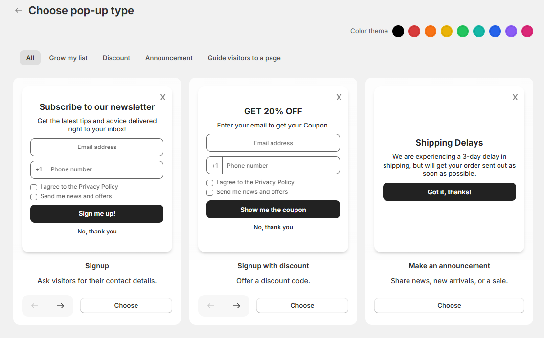
Above the cards is a row of tabs that filter by goal — All, Grow my list, Discount, Announcement and Guide visitors to a page — and a Color theme picker in the top-right corner that sets the starting colours for the pop-up you are about to create. You can always change the theme later - in the Style card the same picker is called Appearance.
Once you are ready with your choice, simply click the Set up pop-up button to start customizing it.
- Customize your Pop-up.
Regardless of the pop-up type you chose, the following settings can be customized. They are divided into cards: Settings, Consent (on signup pop-ups), Content Screens, Discount code email (on discount pop-ups), Position, Media and Style.
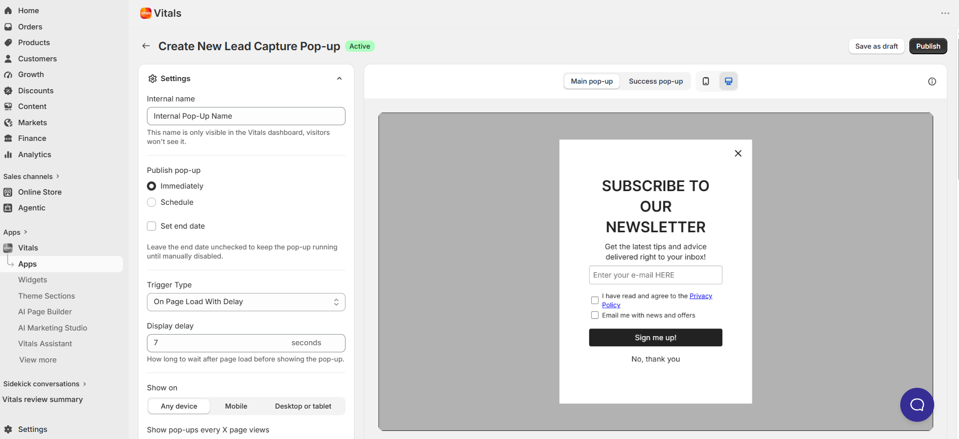
- Publish pop-up - choose whether the pop-up goes live Immediately or on a Schedule. If you schedule it, set a Start date, Start time and Timezone, and optionally tick Set end date so it stops on its own. Leave the end date unchecked to keep it running until you turn it off. This is how seasonal and BFCM campaigns are usually set up.
- Internal name - Since you can create multiple Pop-ups, you can easily distinguish between them by giving each one an internal name. It is only visible in your Vitals dashboard — visitors never see it — and it is also what the editor shows as the page heading, so a clear name makes a long list much easier to work with.
- Display rules - under the internal name, the Settings card sums up when your pop-up appears: Devices, Pages, Trigger, Frequency, Schedule and Audience. Click Edit display rules to change any of them in one place, then click Done. The window has these sections:
- Devices - choose where the pop-up can appear: All devices, Mobile or Desktop.
- Pages - choose which pages the pop-up can appear on: All pages, All pages except the ones you pick, or only Specific pages. Pick pages by type — Homepage, Cart, Collections, Products, Pages, Blogs, Blog posts and Policies — search for a specific product or collection, or paste a link. The cart page follows this setting like any other page, so if you would rather keep a pop-up away from the cart, one of the last steps before an order is completed, choose All pages except and add Cart. Switching between the three options clears any pages you have already picked, so choose the option first and add your pages afterwards. If you pick Specific pages or All pages except and leave the list empty, saving shows You need to select at least a specific page or choose All pages option.
- Trigger conditions - choose what has to happen before the pop-up appears. Use Add new condition to add one or more of these:
- On page load - the pop-up appears after the number of seconds you set (0 shows it straight away). The delay decides when the pop-up appears, not whether it beats another pop-up — priority is always checked first.
- Exit intent - the pop-up appears when the visitor looks like they are leaving: moving the mouse pointer out of the top of the browser, or quickly scrolling up on a mobile device.
- Scroll down - the pop-up appears once the visitor has scrolled at least the percentage you set (10% to 100%).
- Inactivity - the pop-up appears once the visitor has stopped interacting with the page for the number of seconds you set (5 to 600). Moving the mouse, clicking, scrolling, typing or tapping all count as activity and restart the clock.
- Number of pages viewed - the pop-up appears once the visitor has viewed more pages than the number you set during their visit. Only pages allowed by the pop-up's Pages setting are counted.
- Cart value - the pop-up appears once the cart total is greater than the amount you set. Choose whether to use the Total cart before any discount applied or the Total cart after any discount applied. The amount is in your customer's currency.
- Number of items in cart - the pop-up appears once the cart holds at least the number of items you set.
- Operating system is - the pop-up only appears on the operating system you pick, such as iOS, Android, Windows or macOS.
- When you add more than one condition, choose how they combine. AND means all conditions must be met for a visitor to match — for example, a cart worth more than 100 and at least 3 items. OR means at least one condition is enough. Each condition can be added once, and you can drag them into whatever order reads best; the order does not change when the pop-up appears. Pop-ups you created before trigger conditions arrived keep their existing trigger as their only condition, so nothing changes until you edit them.
- Frequency - when a visitor actively turns your pop-up down, this is how long it waits before it can appear for them again. You can set it in hours, days or weeks, and the default is 24 hours. "Actively turns it down" means the visitor used the pop-up's own close (X) button, its No, thank you button, or the Esc key. Other ways of closing do not start this waiting period: if a visitor clicks your main button, or clicks the shaded backdrop around the pop-up, the pop-up carries on with its normal trigger conditions and can appear again on their next page view. This way, the longer waiting period is reserved for visitors who genuinely said no.
- Schedule - under Publish pop-up, choose whether the pop-up goes live Immediately or on a Schedule. If you schedule it, set a Start date, Start time and Timezone, and optionally tick Set end date so it stops on its own. Leave the end date unchecked to keep it running until you turn it off. This is how seasonal and BFCM campaigns are usually set up.
- Audience - signup pop-ups stop showing to a visitor once they have signed up through one of your signup pop-ups, while announcement pop-ups keep showing to everyone. Tick Enable bot filter (CAPTCHA) to add a bot filter when visitors enter an email address, for extra security.
-
Tags - the Shopify customer tags to add to everyone who signs up through this pop-up.
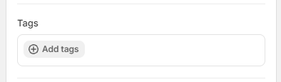
Click Add tags to open the picker, then type a tag and press Enter to create it, or tick one from the list. The list suggests every tag you have already used on your pop-ups, so your wording stays consistent from one campaign to the next. Remove a tag with the x on its chip. This section only appears on pop-ups that collect contact details. An announcement pop-up does not create a customer, so it has no Tags section.
ℹ️ Everyone captured by Vitals already receives the VITALS tag, and that does not change. Anything you add here goes on top of it.
- Your tags are applied when someone submits the pop-up, whether or not they tick the marketing consent box, so they apply from the moment you add them and do not go back over people who signed up earlier.
- If the shopper is already a customer, your tags are added to the ones they already have and nothing is removed. The one exception being a pop-up that collects a phone number only, where an existing customer is not re-tagged.
- Overlay - the shaded backdrop behind your pop-up. Choose Show to require visitors to interact with the pop-up before they carry on browsing, or Hide to let them keep clicking around your store while the pop-up stays on screen. The default is Show, so pop-ups you already created keep behaving exactly as they did.
- Close popup when clicked - available when the overlay is set to Show. Leave it on (the default) and clicking anywhere on the backdrop closes the pop-up. Turn it off if you would rather visitors close it with the pop-up's own close button. Either way, pressing Esc always closes a pop-up.
- Clicking the backdrop counts as dismissing the pop-up for that page view only — it does not start the Frequency waiting period. Only the pop-up's own close (X) button and its No, thank you button and the Esc key do that.
Consent card - shown on signup pop-ups, this is where you handle the consent checkboxes that appear under the form.
- Collect privacy consent - shows a checkbox visitors must tick to accept your Privacy Policy before they submit their details.
- Text - the wording next to the privacy checkbox. Use Dynamic text to insert the {{ privacy_policy }} placeholder, which links to your privacy policy.
- Privacy policy URL - the link to your store's privacy policy. If you don't have one yet, you can make one with Shopify's Privacy Policy Generator.
- Collect marketing consent - shows a checkbox visitors can tick to join your email or SMS marketing list. When a visitor is shown this checkbox, they have to tick it before the form will submit, so anyone who signs up while seeing it is saved in Shopify as subscribed. Visitors who are never shown a marketing checkbox — for example, when it is switched off, or they are outside Europe and the checkboxes only show to European visitors — are saved as subscribed, because submitting their details counts as signing up.
- Text - the wording next to the marketing checkbox.
- Show consent checkboxes to - All countries or Only European countries. This appears once at least one of the two checkboxes is switched on.
- These consent settings are shared, so they apply to every pop-up in your store.
Content Screens card
This card holds the wording of the pop-up itself, split across screens. A preview switcher above it lets you flip between Screen #1 and Screen #2 as you edit. (An Add new screen button is visible but not available yet — it is badged Soon.)
Screen #1 - the pop-up your visitor first sees. This is where you define and customize its content, like:
- Heading
- Body
- Contact fields - Email Address, Phone Number, or both Email Address and Phone Number
- Button text
Screen #1 also has an Add field button, which lets you add:
- Countdown timer - a live countdown inside the pop-up. It is only available once your pop-up has an end date, so switch on Set end date in Edit display rules first. Adding it gives you a Countdown title field, where the Insert timer action drops the timer into your wording.
- Dismiss button - the secondary "No, thank you" link that lets a visitor turn the offer down.
Screen #2 - the success screen.
- If the pop-up type you chose is either Signup or Signup with discount, you can define the custom text that will appear in the success pop-up.
- If you have chosen Signup with discount, this is also the area where you can place the discount code that you will provide to your customers, after they signed up on Screen #1. You can also have that code emailed to each subscriber the moment they sign up — under the field you'll see You can also email this code to subscribers, and the Set up email link next to it takes you straight to the Discount code email card:
💡 The code in the Discount Code field must be a real Shopify discount code, otherwise your customers won't be able to use it. If you're using Vitals inside your Shopify admin, you can create that code without leaving the pop-up editor: click Create discount next to the Discount Code field, choose the type of discount — Amount off order, Amount off products, Buy X Get Y or Free shipping — and fill in Shopify's own discount form, which opens right over the editor. Once you save it, the new code is filled into the Discount Code field for you and you'll see Discount created in Shopify and filled in below. If the code doesn't appear, copy it from Shopify and paste it into the field. Using Vitals outside the Shopify admin? Create the code in Shopify admin > Discounts first, then paste it into the Discount Code field.
Make sure you create a discount code, not an automatic discount. The pop-up hands your visitor a code to copy, and an automatic discount has no code, so it won't work in a pop-up. You'll see a reminder about this under the Discount Code field.
The Discount Code field can't be left empty. If it's empty when you click Publish or Save as draft on a Signup with discount pop-up, the editor opens Screen #2 and shows This field can't be empty under the field. Add your code and save again.
A new Signup with discount pop-up starts with an empty Discount Code field — the greyed-out example inside it is only a placeholder, not a real code, so replace it with your own.
In addition, Shopify discount codes can now be combined with automatic Vitals discount codes on order, using Shopify's Discount Combinations feature. More information about this and its requirements can be found here: Combine Shopify Discounts with Vitals Discounts in an Order
Discount code email card
This card emails the discount code to each subscriber as soon as they sign up, so the code isn't lost if they close the pop-up before copying it. It only appears on Signup with discount pop-ups, and it is store-wide: one switch and one email template cover all of your discount pop-ups, so anything you change here applies to every one of them.
- Send the code by email - switch this on to start sending. The badge at the top of the card tells you at a glance whether the email is going out.
- Customize - opens Customize email template, where you set the Sender name, Subject, Reply-to address and Preview text, then design the body in the drag-and-drop editor. It is the same editor you already use for the Back in Stock email, and your store has one template for all discount pop-ups.
- Send a test email - sends the saved template to any address you choose, so you can see how it looks before a shopper does. The test uses a sample code rather than your real one, and it sends the template you last saved, so save your changes first.
Every email includes the discount code as text, a button that opens your store with the code already applied to the shopper's cart - so it comes off the total at checkout without them typing anything - and up to four product recommendations, picked from your recent best sellers first and then your newest in-stock products. If you have nothing in stock to recommend, the email simply goes out without the product section.
💡 The email goes to every subscriber who signs up, whether or not they ticked the marketing consent checkbox. Marketing consent decides whether that shopper joins your marketing list — it does not decide whether they get the code they were promised. Shoppers who have previously unsubscribed from your emails are not sent anything. Sending these emails does not use up your email plan's allowance or your contact credits.
Position section
This is where you choose where the pop-up sits on the screen. Desktop and mobile are set separately, so a pop-up can sit in a discreet corner on desktop and along the bottom of the screen on a phone.
- Desktop - pick any of nine spots on a three-by-three grid: top, middle, or bottom, combined with left, center, or right. Whichever you pick, the pop-up keeps a small margin from the edge of the screen so it never sits flush against the browser window.
- Mobile - pick top, middle, or bottom. There is no left or right choice here, because pop-ups always span the full width of the screen on mobile.
You can click a spot on the grid or move around it with your arrow keys. The defaults match how pop-ups have always displayed - centered on desktop, along the bottom on mobile - so pop-ups you already created will not move unless you change them.
Media section
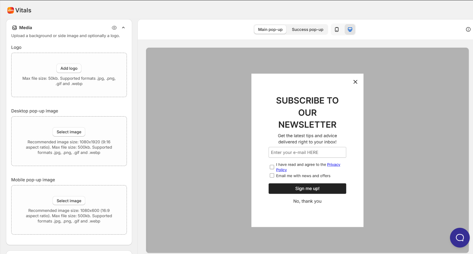
This is where you add the images for your pop-up: a Logo, a Desktop pop-up image and, for layouts that support it, a Mobile pop-up image. Under Image position, choose Background, Left or Right on desktop, and Background, Top or Bottom on mobile, then fine-tune how the image is sized and placed.
If you opened Vitals inside your Shopify admin, clicking Add image or Add logo (or Change on an image you already added) opens your Shopify Files library. Outside the Shopify admin, the same click opens a window where you can Add image from your computer, Select from Products, or pick an image you uploaded before using Search by filename. You can also drag an image straight onto the upload area; .gif, .jpg, .jpeg, .png and .webp files are supported.
Style card
This last card allows you to customize the appearance of the Pop-up app even further:
- Close button style - Round, Square or Plain, for the X icon in the corner of your pop-up
- Content alignment, Heading text size and Paragraph text size
- Button style - Filled or Outline - and Corner radius
- Appearance - pick one of nine ready-made colour palettes (Black, Red, Orange, Yellow, Green, Teal, Blue, Purple or Pink) as a starting point for the colours below
- Background and text color via color pickers (if the available color themes are not sufficient)
- Button colors
- Close button colors - Background, Hover and Text
- Overlay - the color of the shaded backdrop behind your pop-up (only shown when the overlay is set to Show)
- If you added a countdown timer, Style also gains Countdown alignment, Countdown text size and the countdown's Background and Text colors
Save the Pop-up
Once you are done with your customizations, use the buttons at the top of the page: Publish puts the pop-up live on your store (or queues it, if you set a schedule), and Save as draft keeps your work without displaying it to visitors yet.
Choosing which pop-up shows first
Only one pop-up is shown per page view. When several are eligible at the same moment, the one with the highest priority wins, and the next one appears the next time the visitor loads a page. You decide that order from the pop-ups list:
- Open the Pop-ups app to see your list of pop-ups.
- Select Change priority in the toolbar. The list turns into a drag-and-drop view with the instruction Drag the rows to set which pop-up is shown first.
- Drag the rows so the pop-up you want shown first sits at the top.
- Save. You will see a Sorting order saved confirmation.
A few things worth knowing:
- The order runs top to bottom — think of it as a position in the list rather than a number, since you never have to type one.
- Change priority appears only when you have more than one pop-up (drafts included) and the list is on its default sort.
- Reordering always works on the full list. Search and the status tabs step aside while you are dragging, so a filtered view will not limit what you are reordering.
- A new pop-up, and a duplicate of an existing one, goes to the top of the list. A duplicate does not keep the priority of the pop-up it was copied from.
- Nothing changes on your store until you reorder. Every pop-up that existed before this arrived starts on the same priority, and pop-ups on the same priority keep the order they had before.
- Priority is checked first, and each pop-up's own settings — the display delay, exit intent, scroll depth — are checked afterwards. A pop-up set to show instantly still waits behind a higher-priority one.
- Once a visitor has seen every pop-up that is currently eligible for them, the cycle starts again from the top of your list. The record of what they have already seen also resets after a day, so a visitor returning tomorrow starts again from your highest-priority pop-up.
Finding your way around the pop-ups list
Alongside Change priority, the list page gives you:
- Search pop-ups - filter the list by name
- Sort by - Priority (highest first) (the default), Name (A–Z) or Created date (newest first)
- a column chooser, so you can decide which columns the table shows
Pop-up statuses
Each pop-up carries a status badge next to its name and on its row in the list:
- Active - published, and currently displaying on your store
- Draft - saved, but not published
- Scheduled - published with a start date that has not arrived yet
- Expired - published with an end date that has already passed
The filter tabs above the list group these a little more broadly: All, Active, Inactive and Scheduled, where Inactive covers both Draft and Expired pop-ups.
Deactivating a Pop-up
If you would like to temporarily deactivate a Pop-up and use it later, you can select the desired Pop-up in the list through its checkbox and select the Hide option in the menu (3-dots) that appears:

Deleting a Pop-up
To permanently delete a Pop-up, simply select the desired Pop-up to be deleted on the list through its checkbox, and then select Delete in the menu (3 dots) that appears:

❓ App not appearing on your store? The Vitals app might not yet be enabled on your Shopify Theme via the App Embeds section. For more information, you may go here: Enabling the Vitals app via App Embed
Translating the Pop-up
- There are two ways that you can utilize to translate the contents of the Pop-up app:
-
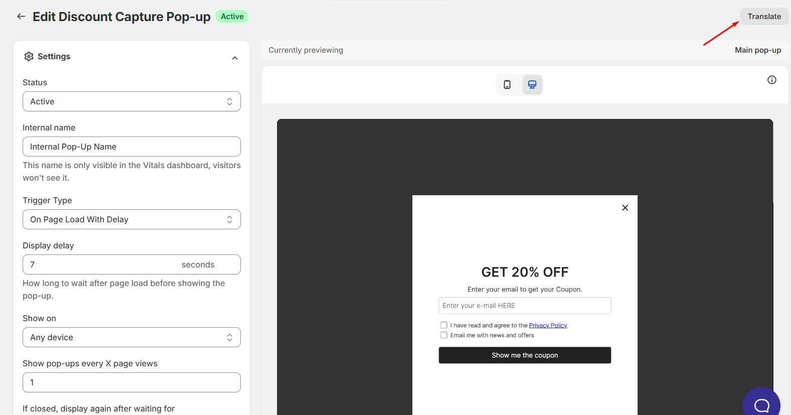
Specific Pop-up translations - Should you like to translate only the content of the specific pop-up you're working on, you can click on the Translate button at the upper-right corner while inside that specific Pop-up app's settings:
-
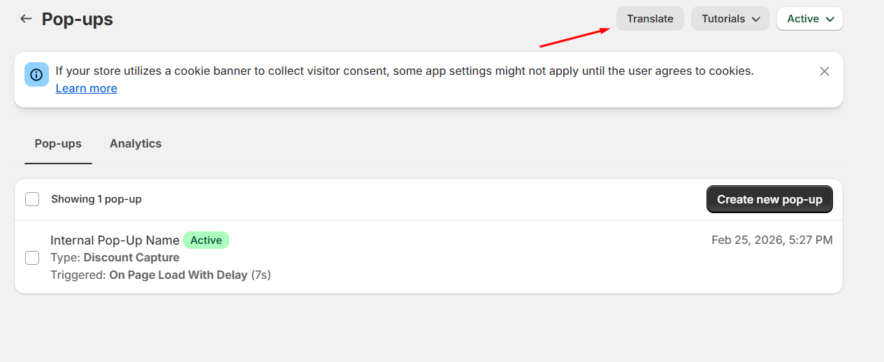
Global Pop-up Translations - Should you like to translate overall, global texts of the Pop-up app, you can click the Translate button while in the main Pop-up app:
-
Checking your translations in the editor - If your store publishes more than one language, the preview in the pop-up editor has a Preview language menu, so you can see the pop-up the way shoppers in each language will. When you pick a language other than your primary one, a note tells you how many fields are not translated yet (shoppers see those in your primary language), and a Translations button takes you straight to this pop-up's translations. On the translations page, the pop-up's texts are grouped under Screen #1 and Screen #2, with the same names you see in the editor, such as Heading, Paragraph and Primary button text.
Tracking how your pop-ups perform
The Pop-ups app has an Analytics tab showing Impressions, Clicks, Closes and Captured emails. It defaults to the last 30 days and compares that against the previous period, so you can see whether a change you made helped.
These figures cover all of your pop-ups together rather than one at a time. Per-pop-up reporting is marked Soon in the app and is not available yet, so if you want to measure one specific pop-up, run it on its own for a period.
❓ App not appearing on your store? The Vitals app might not yet be enabled on your Shopify Theme via the App Embeds section. For more information, you may go here: Enabling the Vitals app via App Embed
Frequently Asked Questions (FAQs)
Does your Pop-up app have animations?
Our Pop-up app does not have integrated animations at the moment. However, we already have this on our suggestions list, and we'll definitely post an update on our Product Roadmap when we have updates about this feature.
Why don't my pop-ups show in the Shopify theme editor?
Pop-ups are deliberately suppressed inside the theme editor preview, so you will never see them while customizing your theme. This is intentional - it stops them from covering the editor while you work. To check a pop-up, visit your live storefront in a private or incognito window instead, which also gives you a clean visitor session so the trigger and frequency rules behave normally.
Can the Pop-up app detect if an email address was already entered?
No, the Pop-up app cannot detect if an email address has already been entered. Here's why:
- Direct Integration with Shopify Customers
- When an email address is captured through the app, it is immediately sent to your Shopify admin > Customers section with the tag
"VITALS". - The Vitals app does not store email addresses independently.
- When an email address is captured through the app, it is immediately sent to your Shopify admin > Customers section with the tag
- Adherence to Shopify Policies
- To comply with Shopify's strict data privacy policies, the app does not maintain its own database of email addresses.
- This means there’s no mechanism to check if a newly entered email matches one that was previously captured.
My pop-up's background shading looks lighter than it used to. Why?
The shading behind a pop-up is now a setting you control rather than a fixed value, and the new default is a lighter, softer shade than the one pop-ups used before. If you would prefer the darker look, open the Style card and set the Overlay color to a darker shade (or raise its opacity).
I set a pop-up to show instantly and a different one appeared first. Why?
Priority is checked before the display delay, so a higher-priority pop-up takes the page view even if it is set to appear later. Move the pop-up you want shown first to the top of the list with Change priority.
Why do I only ever see the same pop-up?
The highest-priority pop-up shows first, and the rest follow on later page views once the visitor has seen it. If your store cannot keep a record for that visitor — because their browser is blocking cookies, or because they declined tracking on your cookie banner — there is nothing to remember what they have already seen, so every page view starts again from your top pop-up.
Can I tag the customers who sign up through a pop-up?
Yes. Open the pop-up and use the Tags section in its Settings card. Add any tags you like: a tag per campaign works well, so you can tell your Black Friday signups apart from your newsletter signups later on. Everyone who submits that pop-up then arrives in Shopify admin > Customers carrying those tags, alongside the VITALS tag Vitals adds to every captured contact, and you can filter or segment on them in Shopify exactly as you would with any other customer tag.
A few details worth knowing:
- Tags are applied at the moment someone submits the pop-up, so they do not apply retroactively to people who signed up before you added the tag.
- Tags separated by commas count as separate tags, and two tags that differ only in capitalization are treated as one, so a tag you spell "Vitals" joins the existing VITALS tag rather than appearing next to it.
- There is no limit on how many tags a pop-up can carry, though a single tag can be up to 255 characters, which is Shopify's own limit — if you type a longer one, the picker shows Tags can be up to 255 characters. and won't add it.
- And the setting is only available on pop-ups that collect contact details, since an announcement pop-up does not create a customer to tag.
Why don't I see the Create discount button?
The Create discount button only appears when you open Vitals from inside your Shopify admin, because it opens Shopify's own discount form. If you're using Vitals outside the Shopify admin, you'll see a link to create the discount in Shopify instead. Create the code there, then paste it into the Discount Code field. The button is only on Signup with discount pop-ups, since those are the only pop-ups that hand out a code.
The button is hidden rather than greyed out, so if you don't see it at all, you are most likely outside the Shopify admin.
I created a discount but the Discount Code field is still empty. What happened?
That's normal when Shopify doesn't hand the code back, which is always the case for an automatic discount. You'll see Discount created in Shopify with a reminder to copy the code from Shopify and paste it into the field. An automatic discount has no code, so it won't work in a pop-up — create a discount code instead. If you close Shopify's discount form without saving, nothing happens and no message appears. If Shopify can't create the discount, you'll see We could not create that discount. Please try again. — in that case, create the code in Shopify admin > Discounts and paste it into the field.
Can I show a pop-up only when several things are true?
Yes. Open the pop-up, click Edit display rules in the Settings card, and use Add new condition under Trigger conditions. Choose AND when every condition has to be met — for example, only show a free-shipping reminder when the cart is worth more than a certain amount and holds at least 3 items. Choose OR when any one of them is enough, such as showing the pop-up on exit intent or after 30 seconds of inactivity. You can also narrow it down with Pages, so the pop-up only appears on the pages you choose.
Can my subscribers get the discount code by email?
Yes. On a Signup with discount pop-up, open the Discount code email card and switch on Send the code by email. From then on every subscriber is emailed the code as soon as they sign up, as well as seeing it on the success screen — useful for anyone who closes the pop-up before copying it. The switch and the email template are store-wide, so they cover all of your discount pop-ups at once. Use Customize on that card to change the sender name, subject, reply-to address, preview text and the design of the email, and Send a test email to see it yourself first.