Finetuning the Product Reviews settings
Last updated on October 22, 2026
Our Product Reviews app's default settings already allows you to display reviews with minimal changes. However, if you're looking for additional customizations, you can go to the Settings tab of the app.
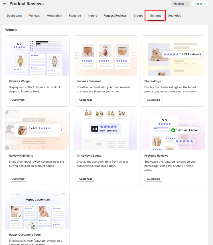
The Settings tab opens on a Widgets grid — Reviews Widget, Write a review, Reviews Carousel, Star Ratings, Review Highlights, Media Reviews Carousel, All Reviews Badge, Featured Reviews and Happy Customers Page. Click Customize on a card to open that widget's own settings page, with a live preview beside the controls. Below the grid you'll also find the Google Shopping, Publishing and SEO, Translations, Advanced display rules and Data management sections.
Below are some of the additional settings you can change, categorized per Product Reviews app element:
Reviews Widget (the main widget)
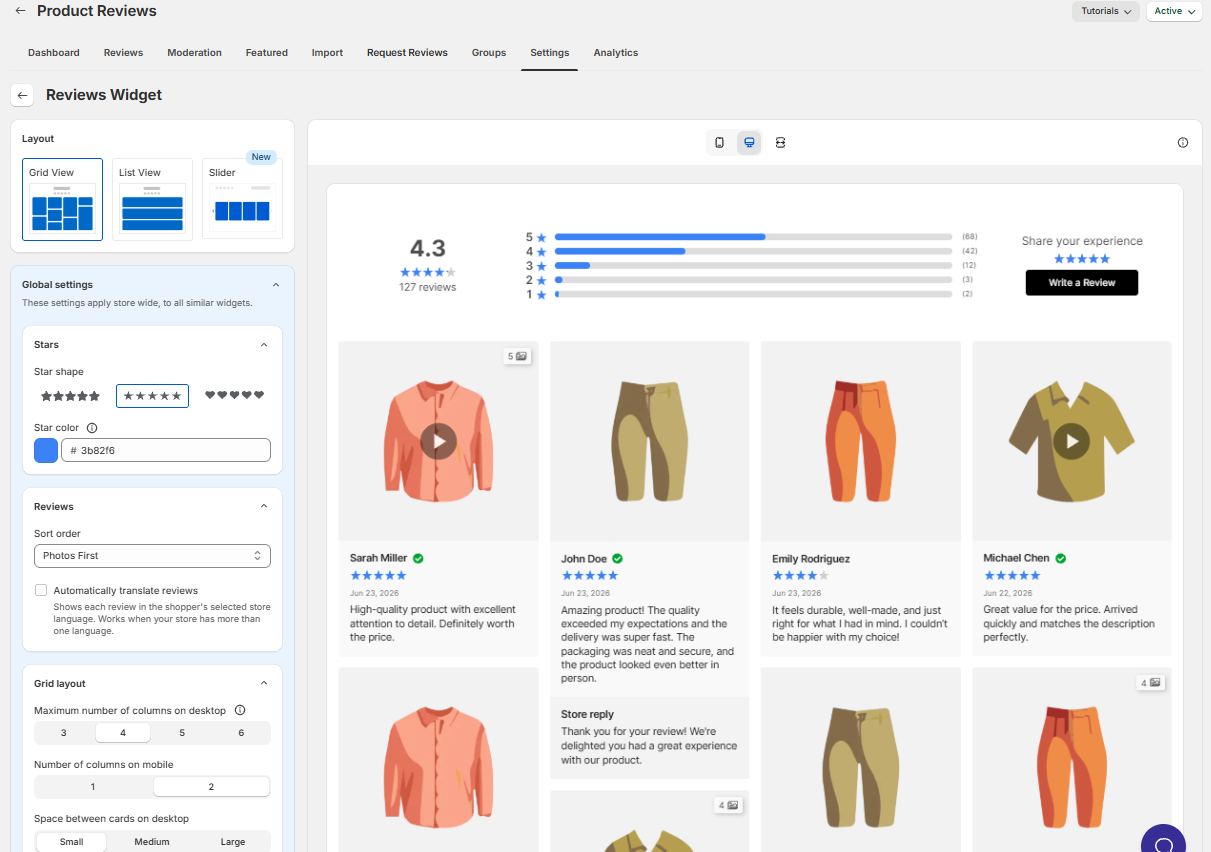
Layout
- Reviews layout - Grid, List or Slider (Grid is the default). Choosing Slider adds a Slider card with its own media, column, card style and arrow options, and removes the number-of-reviews settings — the slider simply shows every review.
Global Settings
These settings apply store wide, to all similar widgets. They are grouped into Stars, Reviews, Grid layout or List layout (whichever layout you picked), Review card, Store Reply box and Buttons.
Stars
Star shape - the symbol used by every reviews widget: Rounded corners, Pointed corners, Hearts, Classic, Outline, Circle, Square, Sharp or Burst. You can choose from these built-in shapes, but you cannot upload a custom star icon or design.
Empty star style - how the unfilled part of a rating is drawn. Filled (the default) draws it as a grey shape in your Empty star color; Outlined draws it as an outline of the shape in your Star color.
Star color - applies to the main widget and the star ratings on product and collection pages. Other widgets have their own star color.
Empty star color - the shade of the unfilled part of the stars. It only appears while Empty star style is Filled.
Rating style - how many decimals the average rating shows everywhere: 1 decimal (4.3) or 2 decimals (4.30).
Reviews
- Sort Order is where you can choose how your reviews are sorted (Newest first, Photos first, Photos and Text First, Verified Buyers first). Photos First is the default. If you turn on the sorting button (see Header below), this still decides the order shoppers see first.
- Translate reviews automatically - Shows each review in the shopper's selected store language. Works when your store has more than one language.
Grid Layout (if Grid Layout is selected)
- Maximum number of columns on desktop (3, 4, 5 or 6)
- Number of columns on mobile (1 or 2)
- Space between cards on desktop (Small, Medium or Large)
- Colors of different texts in this layout
- Review card style - Filled or Outlined. Filled cards can have a Border color (transparent by default), a Shadow placement — All around (the default), Bottom right, Bottom left, Top left or Top right — and a Shadow blur from 0 to 14 px. Outlined cards have a Border color. New stores start on Outlined.
- Show reviewed product divider - draws a line between the review and the product it's for, in its own Divider color. Off by default. (The matching Show divider for the line above your store reply lives in the Store Reply box card.)
List Layout (if List Layout is selected)
- Show avatar - on by default. Turn it off for a plainer look; the Avatar background and Avatar icon color pickers disappear with it.
- Reviewer column alignment on desktop - Left, Center or Right (Center is the default). Mobile stays centered.
- Media size on desktop and Media size on mobile - Small or Large each (Large on desktop and Small on mobile by default). On desktop, Small shows a review's photos as a single row of up to 10 thumbnails; when there are more, the last slot becomes a "+N" tile that opens the gallery.
- Avatar background and Avatar icon colors can be changed here too.
Review Card
- Review card click behavior - allows you to choose where visitors need to click to expand a review card: on the images only, or anywhere on the card.
- Reviewer name format - Allows you to choose how the reviewer names will be obfuscated for security purposes.
- Show Review Dates
- Date format - Allows you to change the date format
- Show 'Verified' badge - Show a Verified badge for reviews from verified buyers. Reviews are verified automatically when matched to an order, or can be marked manually. Once it's on you can pick a Badge style (Icon only, Icon & text or Text only), a Badge icon (Circle, Star, Shield or Crest), the Verified badge color and the badge's Icon size (10–24 px).
- Limit review text length
- Maximum number of text rows
- Cards corner radius
Write a review form
The form's options have their own page: go to Settings → Write a review → Customize. In its General card you'll find Allow customers to upload a photo, Allow customers to upload videos and Require email to post a review (on by default) — turn the last one off to let shoppers submit a review without typing an email. The Form layout option shows the form as one step (Single-step) or as several short steps (Multi-step, the default). The Layout card sets the form and button colors.
Header
Header layout - Expanded or Compact (Compact is the default). Expanded places the rating totals on the left, rating filter bars in the middle and the Write a review button on the right. On wider widgets, Compact places the rating summary on the left and the button and sorting controls on the right. Individual header elements cannot be repositioned through these settings. With Compact you also choose a Rating style: Basic, Minimal, Stars only or Compact.
- Show Write a review button
- Show rating filter bars - If you would like to show a short summary of the number of 5-star, 4-star and n-star reviews at the top of the app, you can enable this option.
- Show number of reviews - with the Compact header this is available unless the Rating style is Stars only; with the Expanded header it appears once the rating filter bars are on. If the Expanded header has rating filter bars turned off, this option is not available: choose Star Ratings → Customize → On product page → Star rating format → Edit format and select the rating-only format, or use Advanced customization to remove the review-count part of the format. This also removes the count from the Vitals stars under the product title when Display Star Ratings on product page is enabled.
- Show sorting button - when enabled, allows visitors to sort the reviews displayed in the storefront via an interactive Sort button. The dropdown offers Most recent, Highest rating, Lowest rating and Photos & Videos first, and all of its labels can be reworded under Translations.
- Show average rating - with the Compact header, shows the average score number next to the stars. On by default; not offered for the Stars only rating style.
- Show media gallery
- Show AI Review Summary - Requires at least 5 published reviews
What shoppers see before your first review
With the Compact header, a product with no reviews shows five empty stars, the message "No reviews yet. Be the first to add a review." and — when review submission and the Write a review button are on — the button itself. No score or review count is shown. The Expanded header still shows the 0.0 score and "0 reviews" count in that state. Both texts come from the Translations section, so you can reword them. In the Shopify theme editor a product with no reviews shows sample reviews instead, so check the live storefront to see this state. The same applies to any widget set to the Compact header, including Featured Reviews and the Happy Customers Page; star ratings on collection pages are not affected.
General
- Show review box for products with zero reviews - toggle whether the reviews section appears at all on products with 0 reviews.
- Hide widget on product page - hides the main reviews widget on product pages while star ratings, carousels and the badge keep working — useful if you show reviews only through another widget.
- Number of reviews before "See more" button - how many reviews load at first, set separately for desktop (20 by default) and mobile (10).
- Limit the total number of reviews shown - off by default, so every review can be loaded. Turn it on to reveal Maximum number of reviews for desktop (100) and mobile (50). Neither setting appears with the Slider layout, which always shows every review.
💡 When the See More Reviews button is clicked, it will not show all of the reviews set as maximum right away. It will show the next set of reviews in intervals (15 reviews for Desktop, 6 for mobile), and a See More Reviews button will be present again. Continuously clicking this button will eventually display the reviews according to the specified maximum.
Product Reviews Colors
You can fine-tune the different colors used in the Product Reviews Main Widget, from simple elements like the reviewer name's colors to the specific colors you would like to use for your store replies.
The colors of the following review elements can be changed:
- Reviewer name
- Review text
- Review card background
- Review card shadow
- Review Date
- Avatar Background
- Avatar Icon
- Store Reply Title
- Store reply text
- Store reply background
- Write A Review Form text
- Write A Review Form Background
- Write a Review Button text
- Write a Review Button Background
- Write a Review Button Border (transparent by default)
- 'See more' button style (Filled or Outline) and its colors
- Sorting button text and Sorting button Border
- Button corner radius (applies to all buttons)
- Store reply divider (Show divider and Divider color, in the Store Reply box card)
The Avatar Background and Avatar Icon colors disappear when Show avatar is off.
Widget title, Spacing and Placement
Three more cards round off the Reviews Widget page: Widget title (alignment and size of the section title), Spacing (maximum width and the margins above and below the widget) and Placement (where the widget sits on the product page, with a manual option for the Shopify theme editor).
💡 Coming from Loox? Start with Empty star style → Outlined under Global settings → Stars, then use the Grid layout's Border color, Shadow placement, Shadow blur and divider options and the Compact header's Show average rating toggle to match the rest of the look. Every new setting keeps the default look until you change it.
Star Ratings
Star rating on product page
Contains settings that will affect the appearance of the star ratings appearing under the product name on your product pages. The toggle is Display Star Ratings on product page — the rating is hidden automatically on products with 0 reviews — and Place star rating moves it above or below the product name.
💡 The Star Ratings format can be changed by customizing the different keywords available:
{{ stars }} -> This is where the star graphics will be seen
{{ averageRating }} -> This is where the average rating of all the reviews of that product will be seen
{{ totalReviews }} -> This is where the total number of reviews of that product will be seen
{{ reviewsTranslation }} -> This is where the "Reviews" word will be seen, which gets automatically translated if the store has multiple languages enabled.
Star rating on homepage and collection pages
Contains settings that will affect the appearance of the star ratings appearing under the product name on your home page and collections pages.
💡 Star rating on the homepage and collection pages already enabled but not appearing? Two things to try before contacting us. First, on Online Store 2.0 themes, use the Manual option on the Star Ratings page: Go to home page or Go to collection page opens the theme editor so you can place the Review Stars (Cards) block exactly where the stars should sit — the page shows an Added to your theme badge once it detects the block. Second, remember that star ratings only appear on products that already have at least one published review. If the stars still don't show, contact our support team.
💡 Seeing two sets of stars on your product cards? Your theme's built-in star ratings are separate from the Vitals Star Ratings, and changing the settings here will not update them. Use the How to disable your theme's default star ratings link on the Star Ratings page — it walks you through turning the theme's rating off in the theme editor.
Reviews Carousel
This feature allows you to display your selected reviews in a carousel/slider format, with different options to customize its appearance. For more information about the settings of this great feature, you may refer to its own Help Center article here: Displaying the Product Reviews as a Carousel
Happy Customers Page
This feature allows you to display your selected feature reviews in a single page to showcase to your visitors, and it has many options to modify its layout and appearance. For more information about the settings of this great feature, you may refer to its own Help Center article here: Displaying featured reviews on a dedicated page
Featured Reviews
Featured reviews are reviews that you can tag inside your Product Reviews app that will be displayed on your homepage or other non-product pages. For more information, you may refer to its own Help Center article here: Displaying featured reviews on the homepage as Cards/List
Publishing and SEO
- Auto-publish New Reviews is where you can choose if reviews from your customers are published automatically or not. For instance, if this is set to Don't Autopublish, any submitted reviews by visitors to the Product Reviews app will not be seen publicly once submitted and will be seen under the Moderation tab of the Product Reviews app's dashboard for you to evaluate and publish/unpublish.
- Get Notified when customers submit reviews - Allows you to receive emails to your store email address when a customer writes a review in our Product Reviews app. If the review includes videos, the email shows clickable thumbnails of them. Use Also send to to add another recipient.
- Show review text in the page HTML - adds your newest reviews (3 by default, see Number of reviews in the page HTML) to the product page source so search engines can read them. Off by default.
- Google Shopping - Syndicate your product reviews to Google Shopping. For more information about this feature, you may refer here: Show Your Product Reviews on Google Shopping
- Display the review rating and count in Google Search - When enabled, this will show the star ratings of your store's products when they are searched and displayed on Google Search Results. For more information about this feature, you may refer here: Product Reviews Rich Snippets
- Banned keywords - add any words you never want published. A shopper review that contains one is not published — even with auto-publish on, it's held for your approval in the Moderation tab. Reviews you import from a file are held the same way, and AliExpress imports skip them entirely. Matching also catches a banned word inside longer words, except for very short everyday words, which only match on their own.